
Jan 25
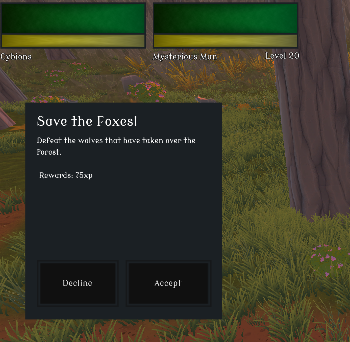
UX Quest popup feels wrong
I do think that Decline and Accept buttons are interchanged. If I refer to windows popups, Accpet is mostly on left while Cancel is almost always the right button
Completed
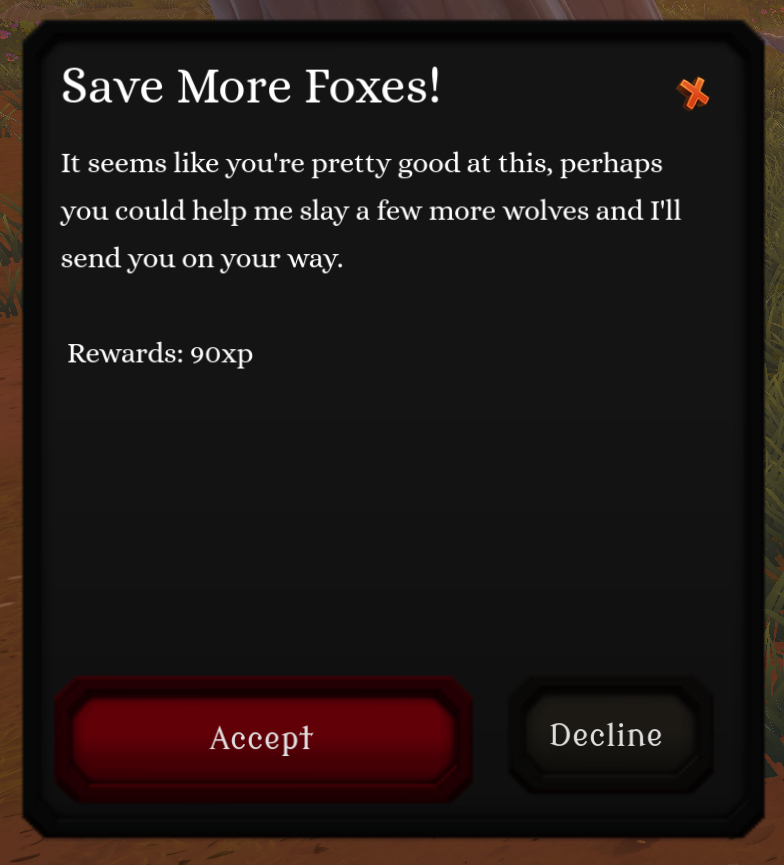
Thank you for reporting this, I've now made the main call to action button (Accept) the one on the left and the Decline button is smaller and on the right. I've also added colors to the buttons to make the UI more user friendly.
From my perspective, placing the primary action (Accept) on the right and the secondary (Decline) on the left follows long-standing desktop UI conventions. Swapping them would actually feel more like a dark pattern to me, since it goes against what users have historically been trained to expect. In my opinion (and I think most left-to-right readers) this UI should stay the way it is or it would be misleading.